Pixel resolution in the context of Web graphics and Print, 72ppi or 96ppi? Or more?
RESOLUTION in images – What the term ‘resolution’ means is defined by the context and there are several ones.
That topic could fill a book – here, let’s try to keep it brief, touch the most important areas. If you work with digital images in a image editing tool it will most likely take care of things correctly…. but it is never wrong to know why things are done in the way they are done. Especially when the images are used for websites and/or print products then some knowledge comes handy.
Print resolution vs. Web resolution vs. Screen resolution vs. Camera resolution
We have to differentiate between 2 worlds: Online/Digital vs. Print.
Everything that has to do with digital images is purely defined by pixel dimensions WIDTH by HEIGHT.
On a display the visual size of an image (=how large we see an image) is defined by how many pixels are squeezed into 1 inch of the screen. In the print world the same applies for the printed outcome: for a certain quality you need a certain amount of pixels per printed inch.
So, pixel per inch (ppi) tells us something about the device where the image is displayed or printed: The digital image itself does not really care, it has a number of pixels and that’s it.
Very long ago computer screens were may be 72ppi or 96ppi but with the years the manufacturers squeezed more pixels in one inch of a screen to be able to keep screen sizes small but still be able to display images with lots of pixels. Example: Notebook screen resolutions with 1980 pixels width became popular but if the manufacturers would have used 72ppi then the screen would require 27 inch (1980/72=~27) width which is not feasible for a notebook. Therefore they e.g. created screen resolutions of 120ppi or similar. Tablets push that number even higher because of their small displays.
In the printing world you get ‘o.k.’ results with ca. 150ppi but for quality print products you should go with 300ppi or higher, depending on what the printing equipment can handle or requires.
Digital image
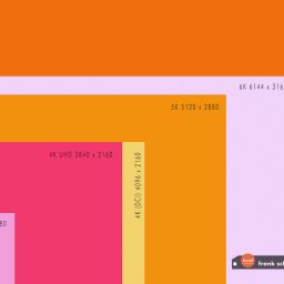
The more pixels a digital image has the more information (color/details/etc.) it will contain. Let’s assume you have a digital camera that takes photos with 3.000 x 2.000 pixels (width x height) which makes 6 millions of pixels of information describing what you photographed. Roughly, that would be a 6 MB (Megabyte) camera … please allow this simplification of the Megabyte calculation here with 1000 bytes instead of the actual 1024.
So, a resolution of 3000×2000 (a.k.a. 6 MB) refers to a camera’s resolution. The more pixels the better: because – e.g. if you take a photo of a colorful flower with lots of gradients, shadows, and colors – then you can distribute these information among all those available pixels (which are a kind of storage cells) and each contains a specific information of the photo – the more you fill the greater the clarity and detail of your photo.
Digital Camera setting ‘image quality’
A digital camera’s setting section allows the user to select a resolution: often the setting is called ‘Image Quality’ and the possible values are e.g. ‘basic’, ‘normal’, ‘fine’, ‘raw, etc.
What these settings refer to in terms of pixels must be read in the camera’s user manual because it varies from camera to camera.
Computer screen
Now let us talk briefly about Computer Screens and their resolution: if it is set to a maximum resolution of 800 x 600 then you will have a hard time to see the above described 3000×2000 pixel photo because our photo has roughly 3.5 times the number of pixels in width and height than the screen has. But if you have a modern screen it might have a resolution of 1680×1050 or even way more. However, it’s still not enough to display the entire photo we have taken because we would need a screen with a resolution of 3000 x 2000 pixels.
Note: we are NOT talking about displaying the picture in a picture viewer because that piece of software actually shrinks the image to a size that fits on the screen: you will find that the zoom factor is something like 25% instead 100%.
Websites and image resolution
That’s why we need to re-size images for display on screens and especially on a website because a website will display an image exactly the size you have created it.
To set the HTML IMG tag’s attributes ‘width’ and ‘height’ OR using CSS rules to resize you image is not recommended because you do not PHYSICALLY re-size the image ! You just display it smaller but the actual image will be downloaded as saved and therefore you waste bandwith and the user ‘waits’ for the image to download. Fast Internet connections blur the actual delay but it is often still noticeable.
What you have to do is to re-size the image with an image editor like Photoshop or similar ones.
Web Image resolution: 72 ppi / dpi? – does it matter? Where does it come from?
To create a web image in a 72 ppi (pixel per inch) resolution has become kind of a non-questioned web standard.
Screens – as outlined above – display pixels horizontally and vertically. Monitors come in physical sizes of e.g. 12 inch, 15 inch, 17 inch or 19 inch or larger but how large (in actual inches) you will see an image on the screen depends on what your screen resolution setting is. You could have a 21 inch monitor and run a 800×600 pixel resolution or may be 1680×1250 and higher. That chosen screen resolution will determine how much you can see on your screen because you place more or less pixels (I referred to them as information storage cells) on the available ‘real estate’ of your screen. The higher the screen resolution the smaller any given image will appear on the same monitor. That means that you should decide for larger monitors if you want to run high resolutions otherwise everything looks tiny.
Example: if you have a screen resolution of 1680 x 1050 (which is e.g. common for Notebooks) and you have an image with a dimension of 840×525 pixels embedded on a webpage then it would fill your screen vertically 50% and horizontally 50% – so to say ‘Half of your screen’.
If your screen resolution is 1024×768 then that image takes approx. 80% of the width and approx. 70% of the height of the screen.
The 72 dpi/ppi (dots per inch / pixel per inch) term was coined a long time ago when Apple came up with the graphical user interfaces and the representation that their screens were set up as: 1 dot (printer terminology) should be represented (size-wise) as 1 pixel on a screen. Because 72 dots would make up 1 inch (1 dot is defined as 1/72 of an inch) on a printer and the same was the case on the early GUI monitors making it 72ppi. Windows systems and monitors soon settled for another internal resolution: 96ppi. That was pretty much the case until laptops with high resolutions and smaller screens started to become ‘normal’ and eventually when tablets and touchscreens with even smaller displays came out but cramping may be 1600 or more pixels on tiny displays. Bottom-line, display manufacturers of small screens sizes with high resolutions reach 200-300 ppi.
Anyhow, back in history, 72 ppi became the de-facto standard for creating web images but actually it is irrelevant!
… it doesn’t matter because -as explained- the screen just counts pixels and how large an image appears on a web page (screen) depends on what screen resolution you have chosen for the physical size of your monitor screen.
Make the test: take an image 300×200 pixels and save save it twice, once with the resolution setting 300ppi and once with 72ppi. On the screen it appears just as a 300×200 pixel image, your screen doesn’t care about the ‘image resolution’ you had chosen.
However, if you would download the 300ppi version from the web and print it directly (w/o changing the resolution in a photo editor software) it would print as a miniature image. Anyhow, if you print the webpage from the browser menu then you are fine!
Mobile devices and terms like: phones, iPads, Retina display, viewport?
With the era of mobile devices and small displays on phones and tablets the world of pixels and screen resolution was thrown into chaos – modern mobile browsers were able to squeeze a 960 pixel website on a miniature screen of a phone.
The new terms ‘viewport’ and ‘scaling’ came into play and changed the rules…
In this article I will not go into that topic because it would fill pages and is not important for the general understanding of pixels in the context of digital images.
Photoshop dialogs for Image Size and the Save for Web dialog
Kilo-Byte thoughts: 300×200 pixel are 60.000 pixels of information and this is one factor (among others like color-depth, compression, etc.) that determines the kilobyte size. In Photoshop you have the ‘Save for Web…’ dialog and this will take care of most things you have to consider for images used in websites. The dialog will automatically set the embedded resolution to 72 by still keeping your previously selected pixel dimensions. It will offer choices for file compression (=quality setting), file type, color-depth, etc.
A preview will show you the overall quality of the image.
Now you will say: “But my Photoshop has also an ‘Image Size’ dialog with a field where I can set the resolution for an image”. Correct!. However, the dialog has two sections, the upper one talks about ‘Pixel Dimensions’ and the lower about ‘Document Size’:
The latter refers to print media not screen media. If you change the resolution from 300 to 72 you see that the actual pixel dimensions in the above fields shrink accordingly. That’s re-sizing of images and it could actually done by just typing in the pixel width and height w/o doing it via the resolution field. So, why are we doing it anyway? Because it gives us the feel that we adapt to the standard term of ‘screen resolution is 72 ppi’.
Remember: there is no such thing like ‘inches’ you can ‘hard-code’ to an image made for a screen: make the test: create a 72 x 72 pixel image, save it with a 72ppi resolution and display it on different screen sizes. Measure it with a ruler and you see it will vary from screen to screen and if you change the screen resolution it varies as well.
In the online world forget about inches and think in pixels!
This said, even if you know, what the difference makes, you should still save your web images in a ’72ppi resolution’ … because everybody does it and because the Photoshop dialog ‘Save for Web’ does it anyway.
This is industry standard, reduces confusion and makes it easier to communicate with others.
But image resolution counts anyway, otherwise, why would we read ‘high-resolution’ images etc.?
Correct – but it counts only for print media. Once you want to print an image you must embed the information for the printing device how many pixels of your width and height you want to print on one inch of paper. The more pixels you squeeze in 1 inch the sharper your image will look when printed. However, the printer will translate this into dpi (dots per inch) or convert it otherwise, depending on the printer / publishing technology.
300 ppi is a value for ‘high-quality’ and your PhotoShop dialog will translate this into width by height inches for you in order to allow you to estimate how large the photo will be printed.
72dpi / 96dpi internal resolution
The internal resolution of either 72 or 96 dpi has still a meaning, especially when it comes to point sizes of fonts…
When 1pt font size is defined as a height of 1/72 inch then a 12pt font displays on a 72dpi internal resolution as a 12px high font. On a system that settles for 96 dpi a 1pt would be represented as 1 and 1/3 pixel making the 12pt font a 16px one on a screen.
Certainly, if you define a font size in your CSS style sheet as points (e.g. 12pt) then it might have an impact on the displayed size in a given browser on Windows or Apple systems – but with modern browsers and scaling of vector data and bitmap images it sounds too complicated to find out what font-size (you should settle for in a website) by doing the math … just try what looks good on different devices :-).
![RGB illumination demonstrated: Red, green and blue lights showing secondary colours with white as FFFFFF [en:User:Bb3cxv, CC BY-SA 3.0 http://creativecommons.org/licenses/by-sa/3.0/, via Wikimedia Commons]](http://www.frankschrader.us/wp-content/uploads/2021/04/wikimedia-RGB_illumination-256x256.jpg)


[…] http://www.frankschrader.us/2013/04/image-resolution-72ppi-vs-96ppi-vs-300ppi/ […]