This article is about giving you an insight into my style and an understanding of the possibilities to edit / photoshop a photo.
My overall style is an ‘authentic’ visualization style, meaning that I like keeping the feel and style of a scene in a photo or video within a realistic range. So, what is outside of that realistic range? Easy answer,… everything that looks too unrealistic to be true.
In order to keep the topic, which is not limited to the Real Estate Photography field, not too abstract I’ll give you some describing examples of over-editing and those are based on what you can find quite often in Real Estate photography — I can’t post here photo examples because I do not want to point at any photographer… because they are entitled to their style and they may be a fit for clients, and I do respect that. I am expressing here my taste and I am not saying that any other photographer is wrong.
Photography is a highly subjective matter, and clients will find the right photographer for them.
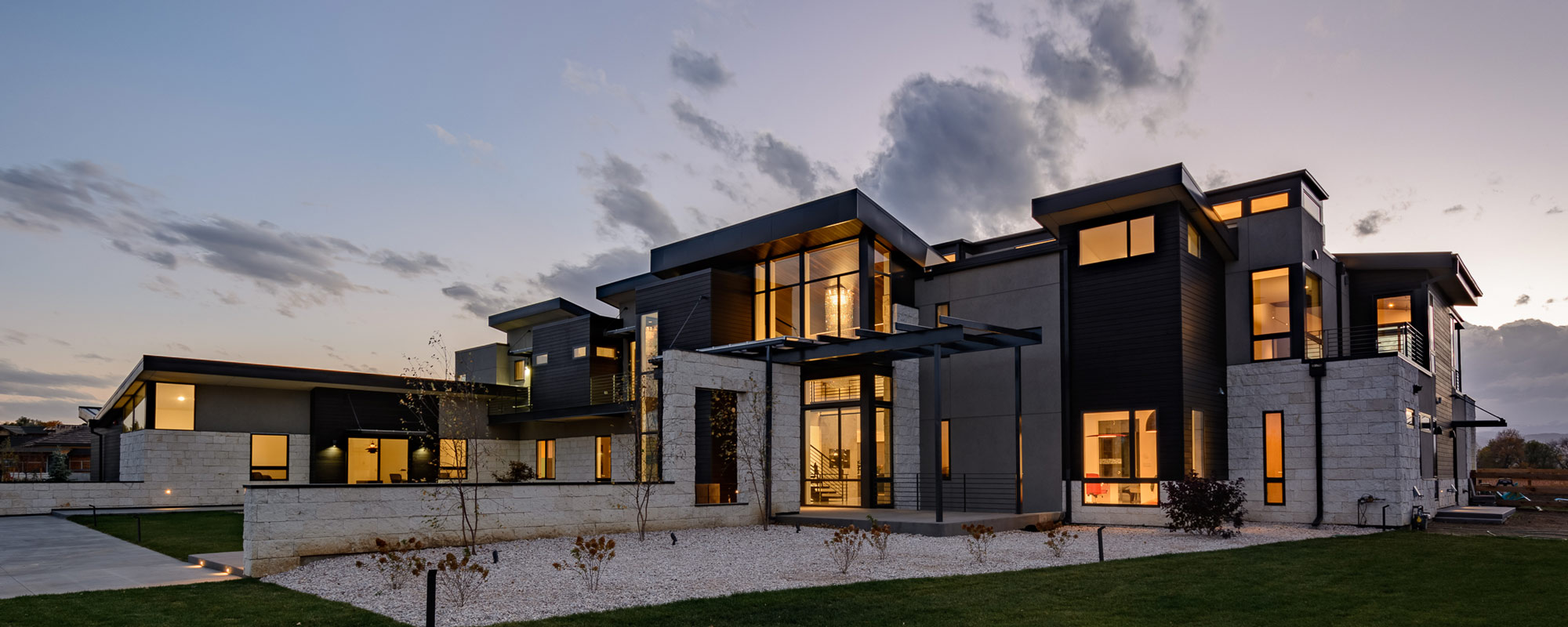
A big topic in Real Estate / Interior photography is HDR, meaning the balancing of contrasts, brightness, shadows on so on: bright light from windows in a room is what makes the rest of the room look either too dark or the windows are ‘blown out’, i.e. are pure white. Neither is good and therefore we can apply HDR techniques. HDR means High Dynamic Range and in photography it is used to capture as many contrasts as possible and come up with a more realistic view like our eyes would experience a scenery. However, technology can’t be as good as our eyes and we make a compromise in photography. Think of Dynamic Range as a range from White, Super-Bright, bright, less bright, moderate-bright, light-bright, light dark, darker, … to Black.
After editing an HDR photo of a room with bright windows it will show the darker areas of the room slightly brighter and at the other end of the spectrum the very bright areas of the windows receive a lower exposure treatment and …voilà,… now we can see what is going on outside the window. Nice views, mountains, ocean, trees, … and often just a neighbor’s home or an ugly fence.
Some photographers drive that HDR thing to the extreme: suddenly the outside (of the window) looks like a pure landscape photo with full or over-saturated colors, contrast and as sharp as a knife. Then they brighten up the room interior as if you would have a floodlight installed and no natural shadows remain existent. Windows do not look like windows anymore, they look like paintings on a wall, and that’s strange for my artistic taste. Usually, what they also do is to bring up the overall color saturation to a point where it looks weird. Actually the entire photo ends up looking totally artificial or differently phrased: unrealistic! Over-saturating exteriors shots is also a thing you find quite a few times. Way apart from a normal scene our eye would experience. Another critique, style-wise, … is that I believe it is wrong to emphasize on windows to the extreme because a real estate photo is about the room and you must keep a users eye focused on that part, not on the outside. Exception is when you have something worthwhile to show outside, e.g. a stunning view, …then you should or must balance the settings: a room with a view! Nice.
My style follows modern photography trends
When I am editing a photo (or video) I make a few decisions about what is important for the photo and scene and where I want (and need) to focus. Definitely NOT on the window with a neighbor’s house or an ugly fence as the ultimate view. On the other hand, in case I have a stunning view I will make that clearly visible in the window, however, only to a degree where it seems natural and doesn’t look like a photo wallpaper or painting at the wall. Even nice trees outside should not be the focus point of the image (unless that is the defined main goal of the image, which could be possible). If I want to elaborate on the views, I take additional photos outside, right? That will, in conjunction with the room image, provide a nice impression.
By the way, in video productions it is way more difficult to balance the bright windows with darker areas of the room and besides of using a Log gamma curve format or raw format you might end up adding light or filtering/masking/darkening windows which makes it lots of work and more expensive, however, without doing the latter you can still produce great content because you might decide that a window view is irrelevant to the story and you can accept an over-exposed window and you focus instead on the person or main object. Also, vice versa, you have seen movies where the person sits at the window and that portion is exposed correctly and the rest of the room appears quite dark because the story and emotion of the scene supports that.
It’s all about decisions, it’s all about creative style.
For all scenarios of interior photos where I have no ‘view’ I like to have the windows appearing on the bright side, not blown out, but mitigating, soothing, or hiding the mediocre or irrelevant views.
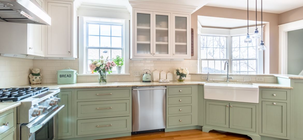
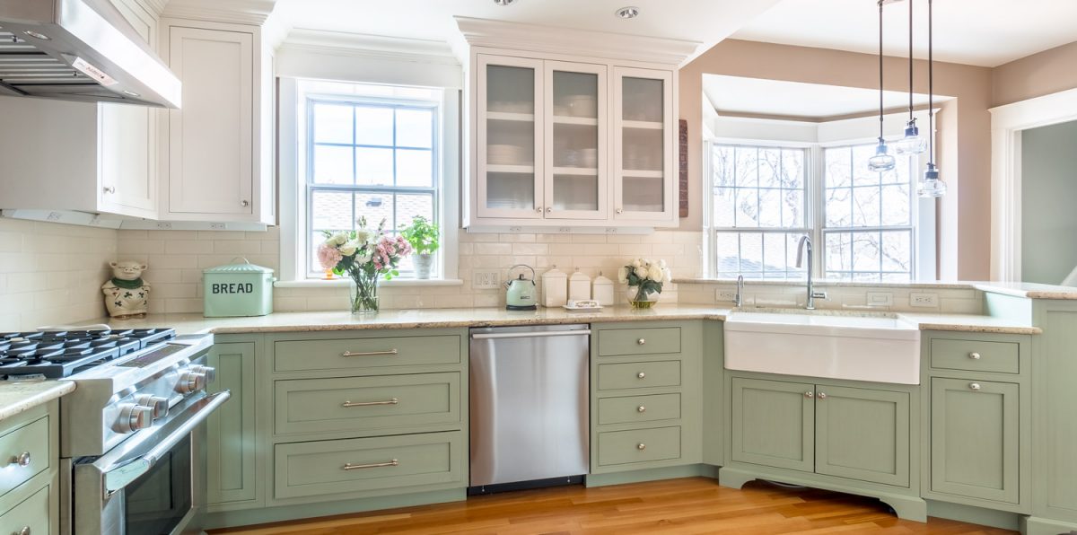
For the interior I optimize colors, I brighten up rooms in a balanced way which means I like to keep the natural light flow intact which leads to lighter and darker areas in the room. That’s similar to how our eyes see a room! Altogether I am creating a natural, ‘authentic’ look, while still optimizing images to enhance their appeal.
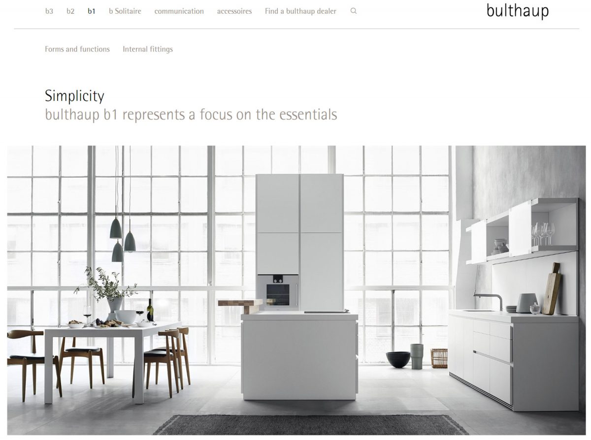
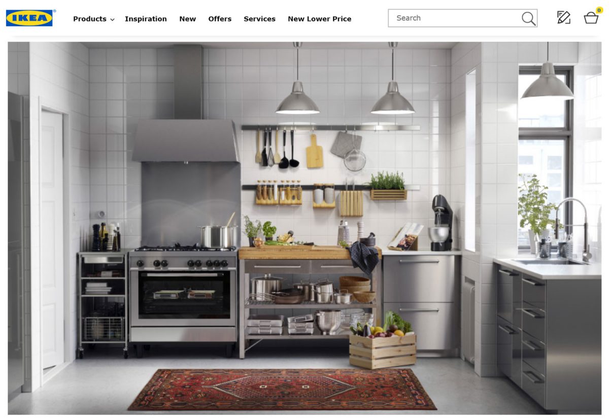
I am following also all sorts of new technology and trends to see what audiences nowadays expect. And I focus on my clients’ goals. If you look at many HGTV photo stories, high-end kitchen manufacturers like Bulthaup, or at modern furniture retailers like IKEA you will learn that the trend is a more natural and often ‘lived in, habituated’ look.
That moderation in editing leads to a clean professional look. Outdated on the other side is over-saturation, fully eliminating shadows, over-HDRing (is that a word?) in general. All those ‘unrealistic’ looking interior photos that make it obvious to the audience that this is NOT what you get.
If you like my style, I am happy to work with you! Check out my website for work samples and lots of information, also pricing which is fully transparent!
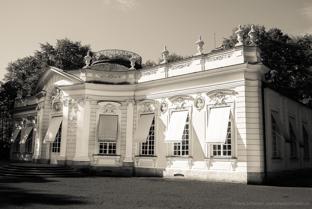
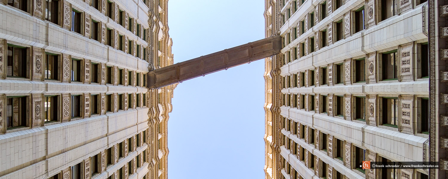
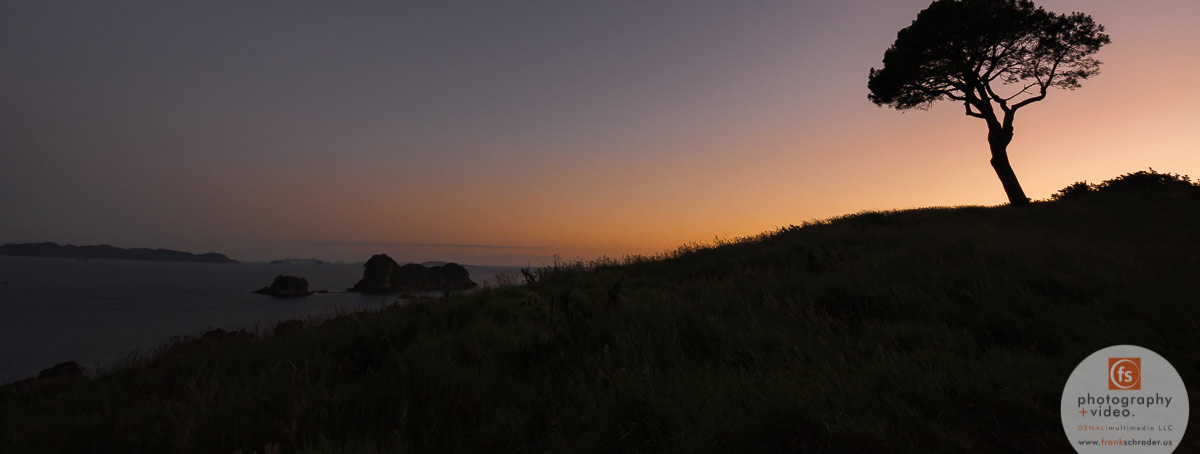
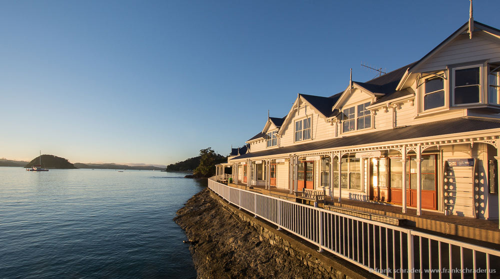
Some real-world screenshots of modern balanced editing and color correction
[…] If you are in the market for hiring a photographer…. then just look at their work and their style… and may be at their prices. Style-wise you will find many differences. My style is an optimized, authentic look and one that reflects the trends in the photography industry and magazines, retailer brochures etc. More on that topic – and why I believe that is the best for Real Estate, Architecture, and Interior Design projects – can be found in my article: Real Estate photography — the right dosis ‘Look and Style’ –or: how much editing is too much… […]