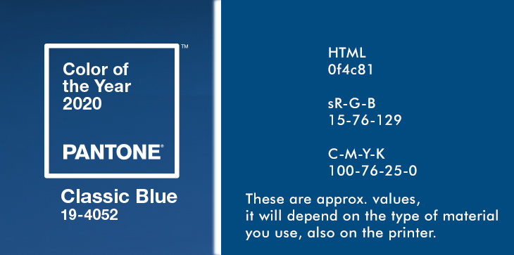
Here we go again: the trend color for 2020 is CLASSIC BLUE, a little lighter than NAVY BLUE.
It will influence designer all over the world and no doubt that you’ll see that color and variations soon in a daily life scenario.
A PANTONE color is a defined solid color which is used in the design world to create a consistent look for your graphics, textiles, print needs etc.
PANTONE offers about 2678 solid colors and that number is growing.
If you want the 100% print outcome you need to print solid colors like in offset printing or spot-color printing which is more expensive.
PANTONE offers a color matching guide called the PMS (Pantone Color Matching System) which takes the guesswork out of replicating the correct color on a given system.
PANTONE offers many tools and visual helpers like conversions, color chips and books to make a designers life easier. The tools are split into different areas, like for GRAPHIC DESIGN (PAPER, PLASTIC, DIGITAL) in applications like Branding, Printed Materials, Packaging, Web Design, Signage and FASHION, HOME+INTERIOR (TEXTILES, COATINGS, PLASTICS) in applications like Apparel, Beauty, Industrial Design etc.
Monitors work on a RGB (3-color) basis and affordable printers usually on a 4-color system, called CMYK. In order to match a PANTONE solid color you need to convert the Pantone color the closest CMYK or RGB representation. You must make compromises and let your visual judgement decide what looks the closest to the Pantone color. That will be your RGB or CMYK value.
The color outcome is determined by the material you print on, and the settings of the printer, so adjustments on printer side may be needed as well. For monitors it is recommended to color calibrate the monitor which at least gives the designer a reasonable representation of the intended color, … even if no designer can control all the different monitors and digital devices where a real world user later sees the color.
Those HTML, RGB, CMYK values above are the TEXTILE conversion and you should use all those values just as a starting point for your own design.
It can be a visual judgement in the end because the BLUE will look anyway different depending on the material it is put on (textiles, paper, plastic and so on).